
First Year – First Semester
Project Overview
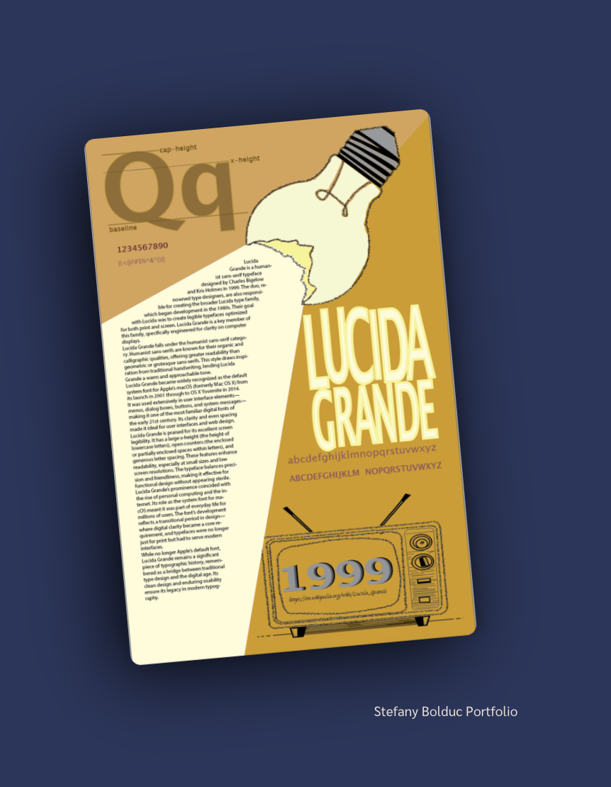
For this poster, I designed a type specimen for Lucida Grande, the humanist sans-serif typeface created by Charles Bigelow and Kris Holmes in 1999. The poster explains the font’s history, its use in macOS, and why it reads well on screen. I wanted it to feel retro, warm, and informative, like a nod to the early digital era.
Visual Hierarchy & Typography
I used a mustard-gold background split diagonally, with a cream text column to make the paragraphs easier to read. The large stacked “LUCIDA GRANDE” title is the first thing viewers notice. Below it, the uppercase and lowercase alphabets showcase the typeface, while the large “Qq” shows its baseline, x-height, and cap-height. The body text uses Lucida Grande, so the poster shows the font at work while also describing it.
Images & Information
I included a lightbulb illustration with a missing piece, with its beam stretching diagonally across the page into the text block. It connects to the word “Lucida,” meaning light or clear, while also guiding the viewer through the poster. At the bottom, a hand-drawn retro TV displays “1999” to show the font’s release year and reinforce the vintage theme. The illustrations, type samples, and written information work together to tell the story of the font.
What I Learned
This project taught me how to create a poster that is both informative and visually engaging. I practiced building hierarchy through scale and using typography to guide the viewer through the layout. I also learned how to combine illustration and typography around one concept while keeping the page organized and the text readable.