First Year – Second Semester
Sustainability Save the Earth Poster.
Project Overview
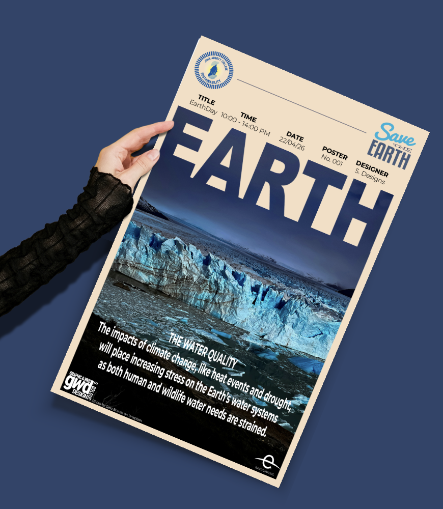
For this poster, I focused on climate change and its effects on Earth’s water systems. I chose this topic because it connects closely to Earth Day. The main image shows a melting glacier flowing into dark water. I wanted the image to make the impact of climate change feel real instead of simply presenting information.
Visual Hierarchy & Typography
I made the word “EARTH” very large across the middle of the poster so it would be the first thing people notice. It works like a magazine headline and creates a strong focal point. The event details, such as the time, date, poster number, and designer, are smaller and placed at the top to keep the layout organized and professional.
Color & Imagery
I used a cream background to balance the cool blue tones in the photograph. This helped keep the poster from feeling too dark or heavy while still matching the serious topic. I also included the “Save the Earth” logo and sustainability seal to connect the design to the Earth Day event.
What I Learned
This project helped me learn how to combine strong typography with photography without letting one take over the other. I also became more comfortable creating a design that needs to inform people while also creating an emotional impact. It showed me how choices like color, image placement, and typography can affect how people understand and respond to a message.
First Year – Second Semester
Bioblitz Poster…
Project Overview
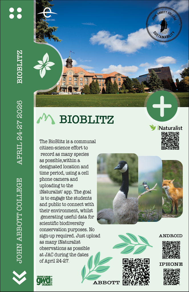
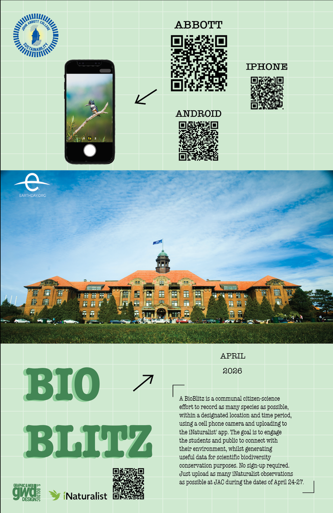
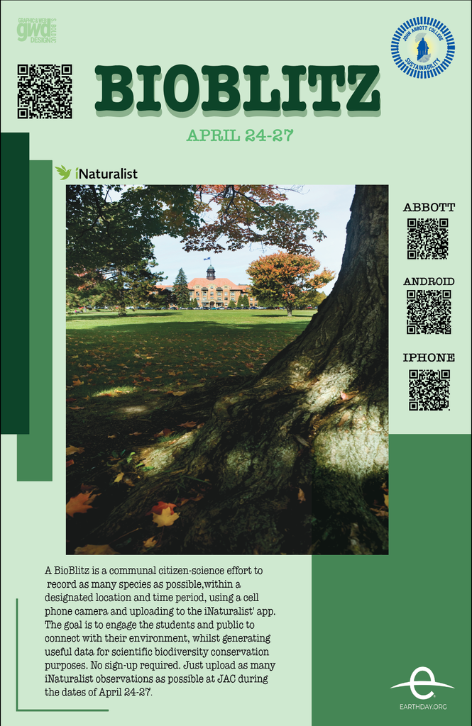
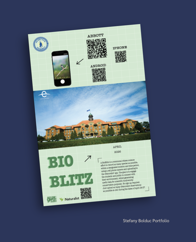
For this poster, I designed a BioBlitz event promoting citizen science at John Abbott College. The event encourages students and the public to use the iNaturalist app to record different species found around campus. I wanted the poster to feel natural, welcoming, and easy to understand.
Visual Hierarchy & Typography
I used a soft green color palette and a grid background to create an eco-friendly look that matches the environmental theme. The words “BIO BLITZ” are large and bold at the bottom of the poster. I used a vintage-style font to make the title stand out while keeping the design friendly and approachable. I also used arrows to guide viewers from the phone screenshot toward the QR codes and show them what to do next.
Images & Information
I included three QR codes for Abbott, iPhone, and Android so viewers could easily access the app. I also used a photo of the John Abbott College campus to help people recognize the location and connect the event to their school. The different images, icons, and information work together to explain the event clearly.
What I Learned
This project taught me how to create a poster that focuses more on instructions than emotion. Instead of only trying to make the poster visually interesting, I needed to clearly explain the steps: download the app, take photos, and upload observations. It also helped me improve at organizing images, icons, QR codes, and text without making the design feel too crowded.