









First Year – First Semester
Project Overview
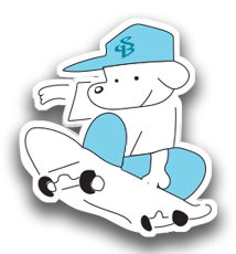
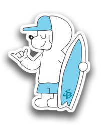
For this project, I designed a sticker pack starring a mascot character. He is my dog, “PATCH,” who is showcasing my characters and personality in a hoodie, a baseball cap, and shorts. Each of the 11 stickers shows him doing a different activity. These include basketball, hockey, skateboarding, surfing, weightlifting, rock climbing, baseball, and playing guitar. I wanted the set to feel playful, laid-back, and relatable. It should look like a character people would want to stick on a laptop or water bottle. This is still a work in progress. I keep adding new versions and refining the designs, so the pack grows and improves over time.
Visual Hierarchy & Typography
I kept the color palette simple: light baby blue, white, and clean black outlines. Small touches of orange, tan, and black make props like the basketball, guitar, and leather jacket stand out. The blue cap and shorts repeat in every sticker. This ties the set together and makes the character instantly recognizable. A small “SB” monogram sits on the cap and on the surfboards. The lettering works as a subtle brand mark instead of a headline. Each sticker has a thick white die-cut border and a soft drop shadow. This makes the characters pop off the page and look like real stickers. The poses are dynamic, with action lines behind the skater, hockey player, and batter. Calmer poses, like the character in the camping chair, add variety.
Images & Information
Every sticker keeps the same character design but changes the pose, outfit, and props. Each one shows a different hobby. The cowboy hat and boots, the black jacket and rock-on hand sign, and the shaka gesture add personality and humor. I arranged the stickers in a loose grid with even spacing. Each one reads clearly on its own, while the whole sheet still feels like a cohesive collection. Because the pack is still evolving, the layout is flexible. New stickers and versions can be added without breaking the set.
What I Learned
This project taught me how to build a consistent character that can be reused across many poses and scenarios. I practiced keeping a limited color palette and a clean line style so the set stays unified. I also learned how props, clothing, and motion lines can tell a story without any text. Since I keep revisiting the stickers, I have learned that a design is never really “finished” in one pass. Each new version is a chance to improve the linework, the poses, and the overall consistency of the pack.