
First Year – Second Semester
CLASSIC PORSCHE MAGAZINE PROJECT…
Project Overview
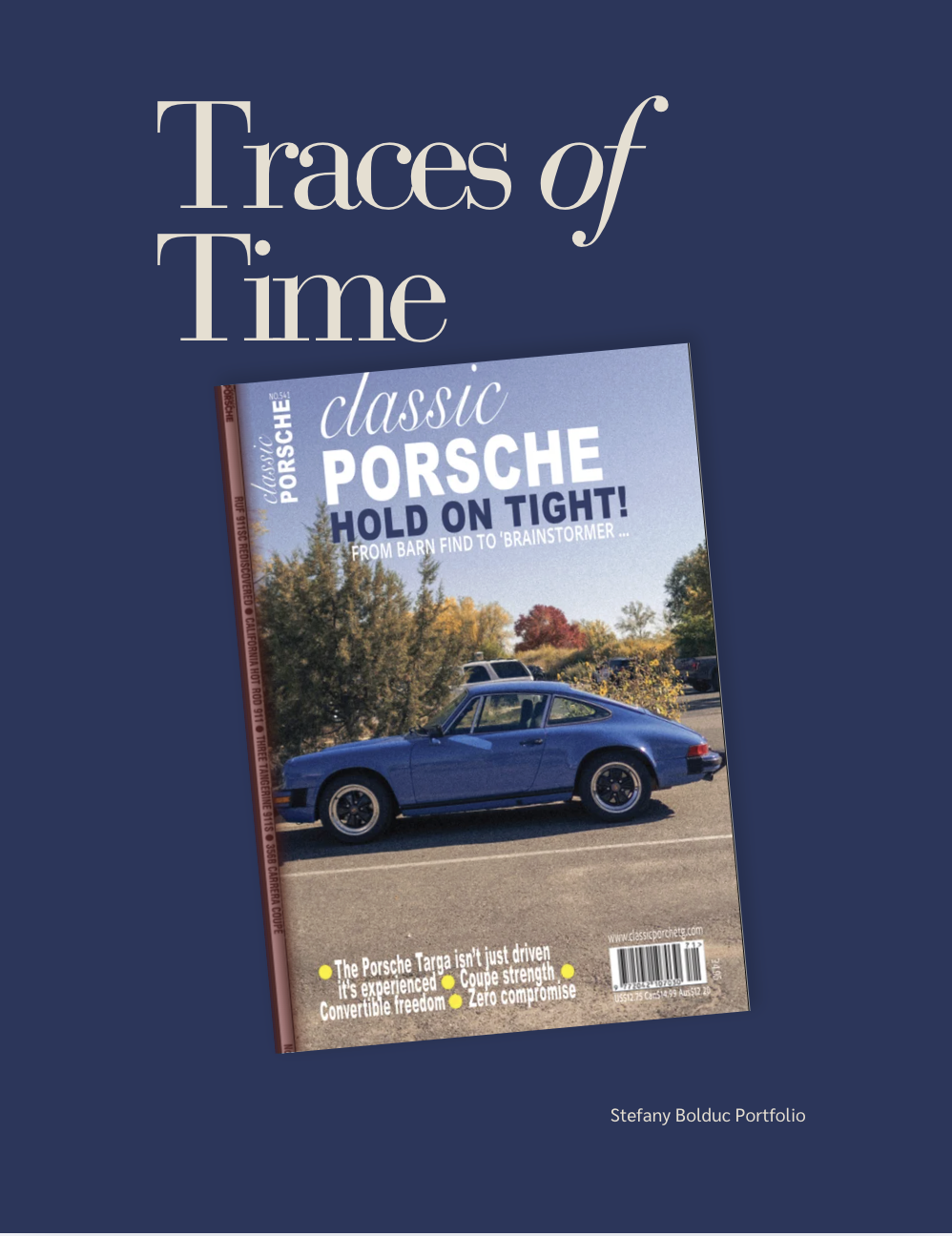
For this poster, I designed a classic car magazine cover aimed at Porsche enthusiasts and collectors. I chose this audience so I could use familiar references, such as Porsche model names and motorsport-inspired colors. The goal was to create a cover that would immediately appeal to people who appreciate classic cars and Porsche history.
Visual Hierarchy & Typography
To create a strong visual hierarchy, I placed the magazine title at the top of the page using bold script and sans-serif typography. Below it, the large headline, “Hold On Tight!”, grabs attention and introduces the featured story about a restored barn-find Porsche. The car photograph occupies most of the lower portion of the page, making it the main visual focus. I combined an elegant script font with bold, heavy typography to balance heritage and performance, while the smaller cover lines remain easy to read without distracting from the main message.
Color & Brand Identity
Color played an important role in reinforcing the theme of the magazine cover. The navy, red, and white color palette was inspired by Porsche’s racing heritage and brand identity. These colors help connect the typography and design elements to the subject matter while creating a professional and cohesive appearance.
Design Challenges & Solutions
One of the biggest challenges was placing text over a detailed photograph while keeping everything readable. Because the image contained many different tones in the sky, trees, and pavement, I relied on strong contrast and bold typography to improve legibility. Another challenge was balancing the hierarchy of the masthead, headline, subheadline, and cover lines. Careful adjustments to size and placement helped establish a clear focal point and prevent the page from feeling cluttered.
Final Outcome
Since the Porsche needed to remain the main subject of the cover, I had limited space for text placement and had to work around the image rather than over it. I also experimented with several color combinations before choosing one that complemented both the photograph and Porsche-inspired branding. Throughout the design process, I focused on creating a clear and intentional layout that highlights the vehicle while communicating a strong magazine cover concept.
First Year – Second Semester
SURF MAGAZINE PROJECT…
Project Overview
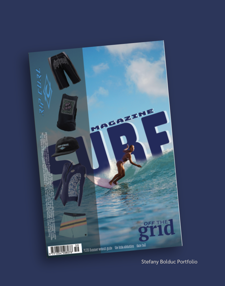
For this poster, I created a surf lifestyle magazine cover inspired by Rip Curl. The design is divided into two sections. The left side showcases Rip Curl products, including boardshorts, a rash guard, a cap, and a wetsuit top. The right side features a surfer riding a wave to represent the excitement and lifestyle connected to the brand. This approach allows the poster to appeal to both people looking for surf gear and those attracted to the surf lifestyle.
Visual Hierarchy & Typography
To create a clear visual hierarchy, I made the word “SURF” the largest element on the page. It acts as the main focal point and immediately grabs attention. “MAGAZINE” appears above it in a smaller size, while “OFF THE grid” is placed near the bottom right to guide the viewer’s eye through the design. The bold, italic typography helps create an energetic feeling that matches the action-sports theme, while the smaller cover lines provide information without distracting from the main title.
Color & Brand Identity
The colors and images help connect the two sides of the poster. The Rip Curl logo and blue-green color palette on the left blend well with the ocean tones in the surfing photograph on the right, creating a unified design.
Design Challenges & Solutions
The biggest challenge was combining product photos and an action image without making the poster feel like two separate designs. To solve this, I used a gradient transition between the two sections and allowed the large “SURF” title to stretch across both sides. Another challenge was making sure the title remained easy to read over the busy wave image. Using large lettering, a bold font, and strong color contrast helped improve readability.
Final Outcome
I also had to organize many elements, including product photos, headlines, the logo, and supporting text. Careful sizing and placement helped create a clear visual flow. Throughout the design process, I focused on keeping the message clear: connecting Rip Curl products with the surf lifestyle they represent.
First Year – Second Semester
LE GUIDE DE L’AUTO MAGAZINE PROJECT…
Project Overview
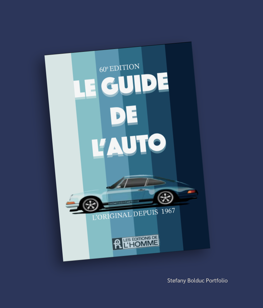
For this poster, I designed a book cover for Le Guide de l’Auto, an annual guide for car enthusiasts and people looking to buy a car. Since the book is published in French by Les Éditions de l’Homme, I designed it with a French-Canadian audience in mind. The goal was to create a cover that feels trustworthy, professional, and connected to the automotive world.
Visual Hierarchy & Typography
I created a vertical gradient using five different shades of blue, going from light to dark. The stripes add depth and movement without taking attention away from the title. The large white title, “LE GUIDE DE L’AUTO,” is the main focus of the cover. I used a bold, rounded sans-serif font to make the title feel strong and reliable. For “60e Edition” and “L’Original depuis 1967,” I used a smaller serif font to add a more classic and traditional feeling.
Color & Imagery
The blue color palette is used throughout the cover to create a consistent look. The illustrated Porsche 911 at the bottom also uses similar blue tones, which helps connect the car to the rest of the design. Instead of feeling like a separate image, the car becomes part of the overall color story.
Design Challenges & Solutions
One of the biggest challenges was creating depth while only using different shades of blue. I solved this by changing the widths and shades of the stripes to create more movement in the background. Another challenge was fitting “LE GUIDE DE L’AUTO” into three separate lines while keeping it balanced and easy to read. I adjusted the size and spacing of each word so the title still felt like one complete phrase.
Final Outcome
I also had to find the right place for the car illustration without making the cover feel crowded. I left enough space between the title and the car so that both elements could stand out. I decided not to add extra graphics or information because the simple layout helped communicate the main idea of the book: a trusted and established automotive guide that has been around since 1967.